[ Manicule ]
A brand that points people in the right direction.
Manicule is an AI native documentation studio for developer tools. Six months after the identity shipped, the company repositioned around a new audience. The brand did not need redrawing.
- client
- Manicule
- role
- Concept, identity, illustration
- year
- 2026
[ 01 ]The brief
The ask: we want to look like infrastructure. Serious, structural, not another gradient purple AI brand with a glowing orb.
Docs are the least glamorous thing in the developer ecosystem. Nobody wakes up excited about them. Everybody depends on them.
Manicule's pitch is that documentation is infrastructure. Audited by AI, directed by humans. That split between machine precision and human judgment drove every decision here.
[ 02 ]The name
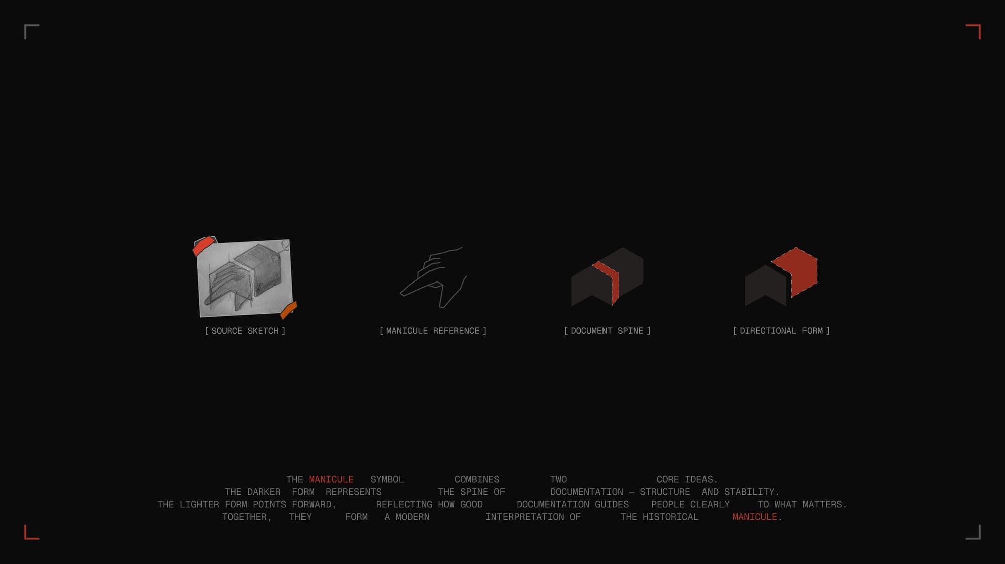
A manicule is the little pointing hand in the margins of medieval manuscripts. Scribes drew them to say look here, this part matters. It is the oldest piece of documentation UI in existence.
The concept was already sitting in the name. Good documentation points people in the right direction. The manicule did that in 1350.
Drawing a literal hand failed every time. It read as a 2009 cursor, a like button, or a nail salon sign, which given the name was a fate worth avoiding. People already hear Manicule and think manicure.
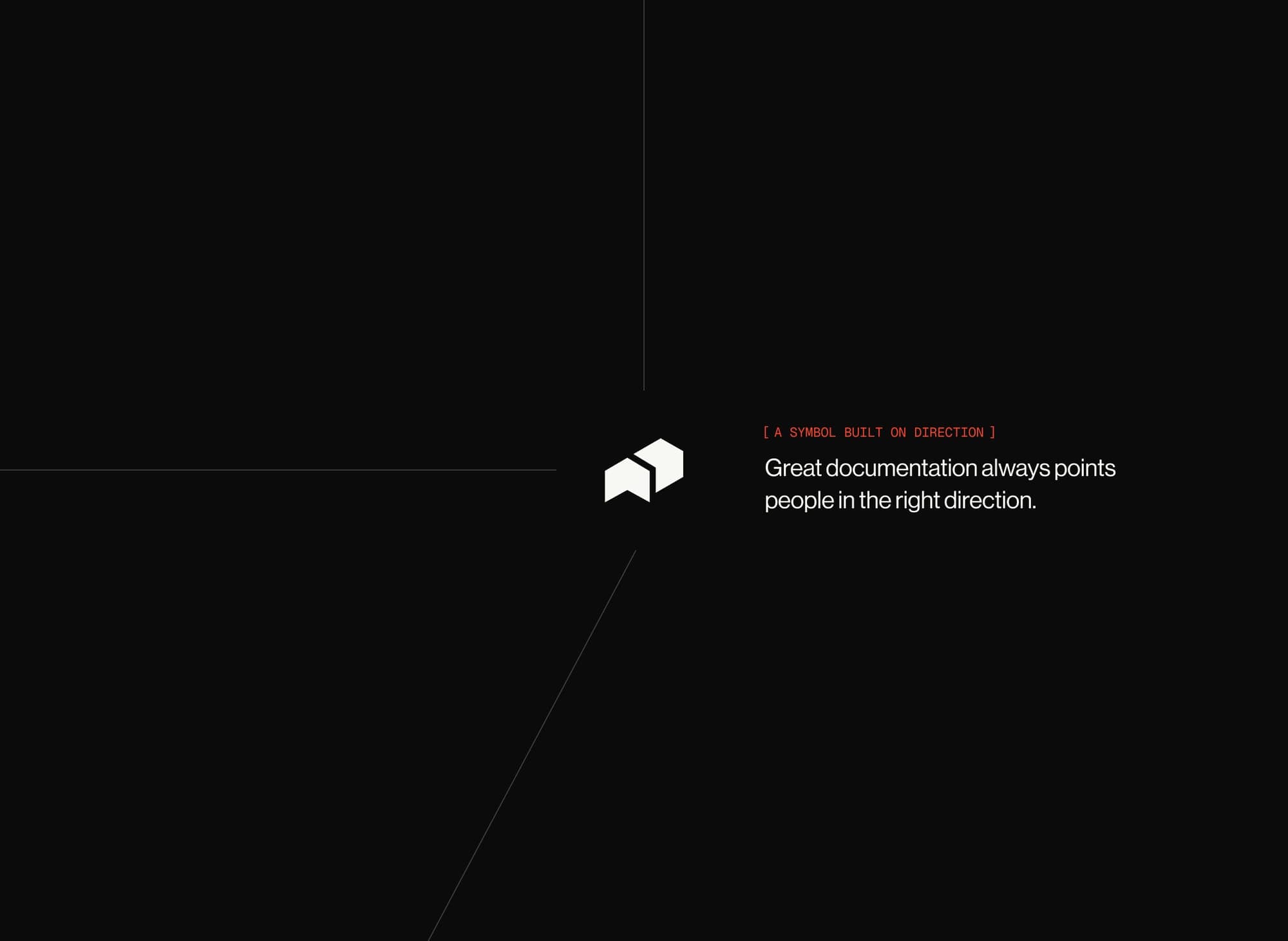
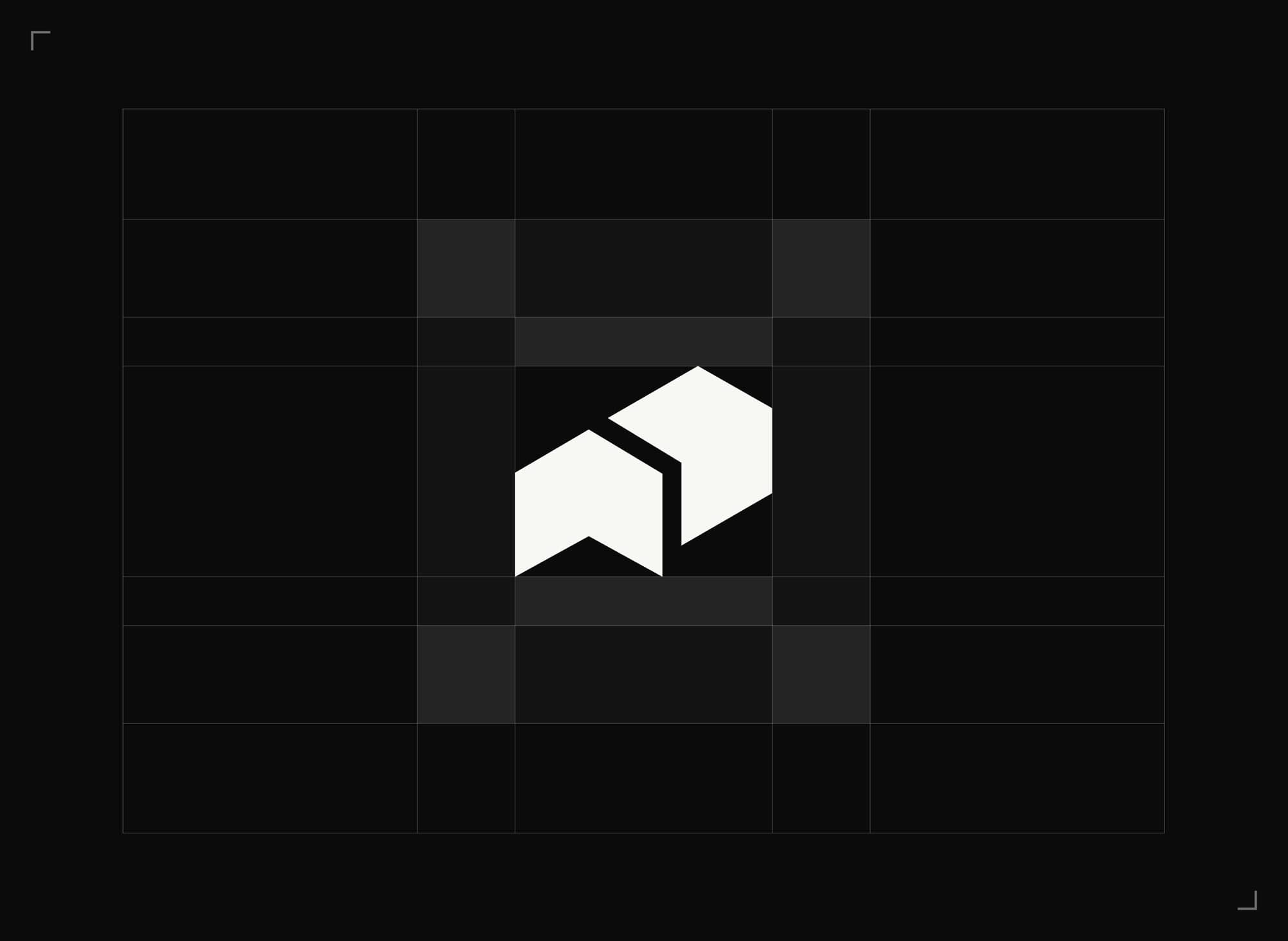
So I abstracted it. Two forms, side by side. The dark one is the spine of a document: structure, stability. The light one points forward. Squint and the knuckles are still there. Don't squint and you get two pages, a folder opening, a chevron. All three readings are correct.
[ 03 ]Typography
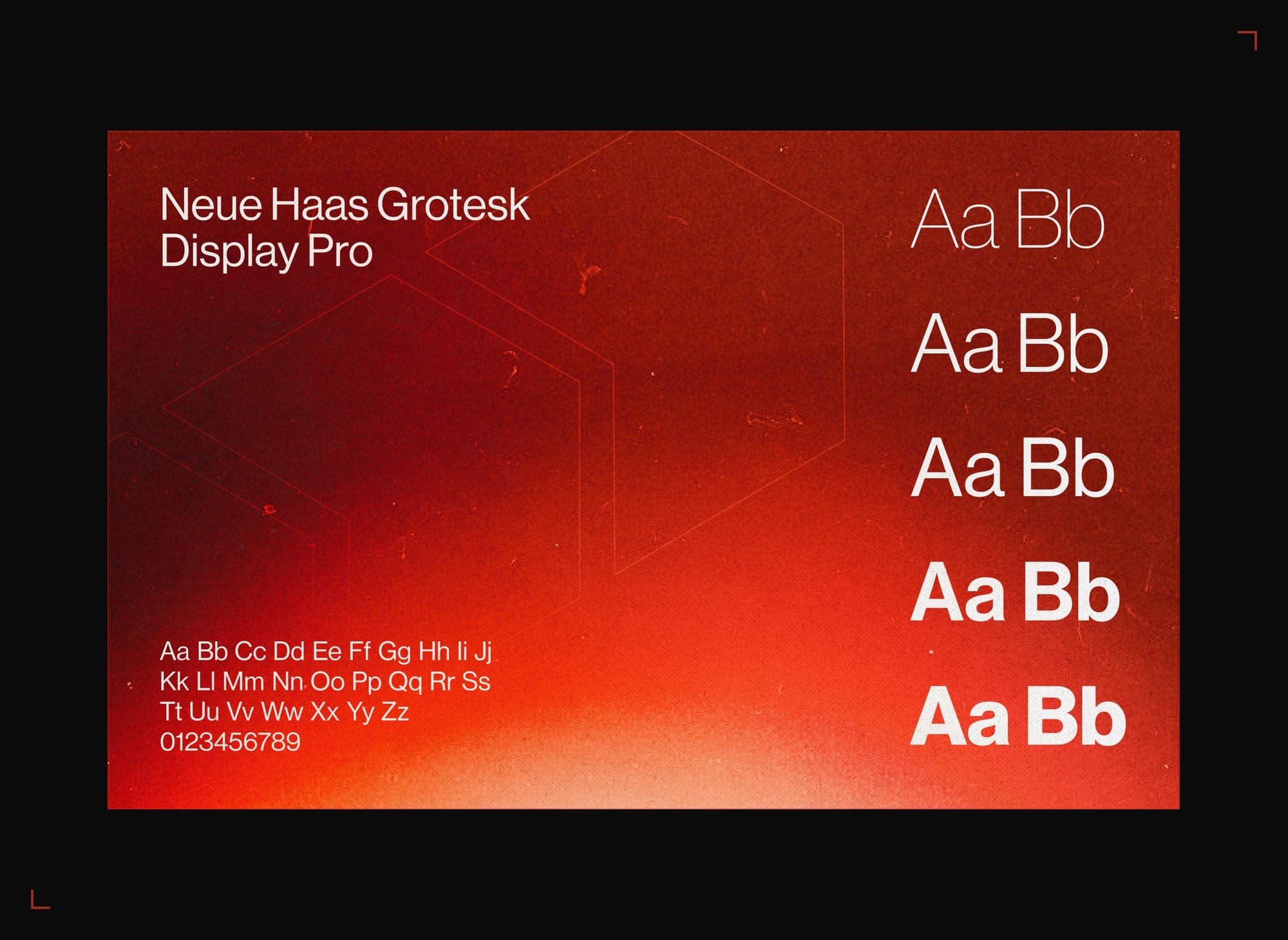
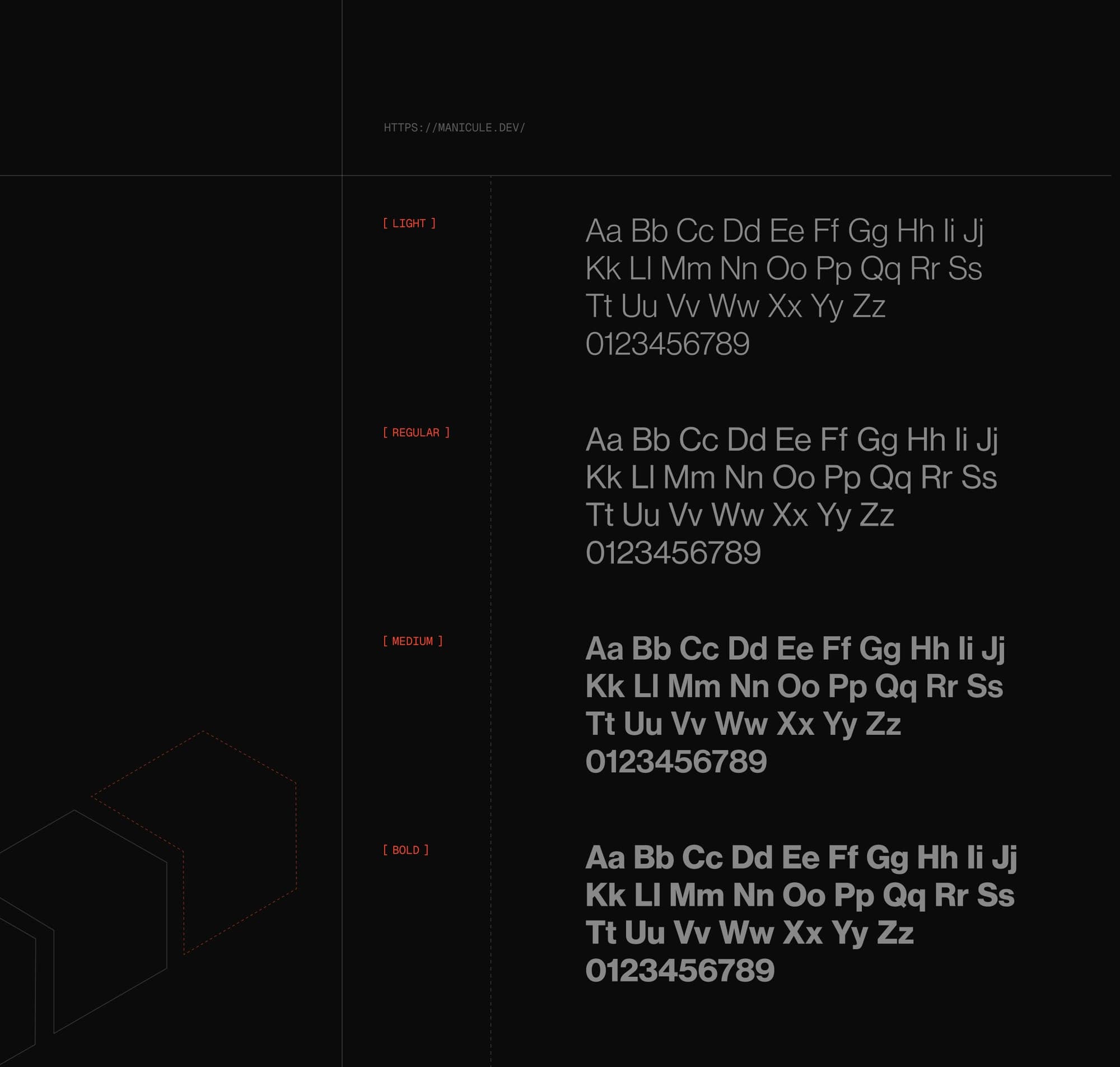
Neue Haas Grotesk Display Pro. The decision took eleven seconds. Manicule brings order to chaos, and the 1957 Helvetica cut has been doing precise and structural for seventy years.
The most rational typeface ever drawn, for a company that makes rational documentation. On message, not lazy.
No custom ligatures, no letter surgery, no chunk cut out of the M to make it distinctive. The symbol carries the concept. In documentation, clarity is the personality.
Everything technical runs in monospace inside brackets, like [ THIS ]. The brackets turn every label into a margin note. A modern manicule, pointing at the content.
[ 04 ]Colour
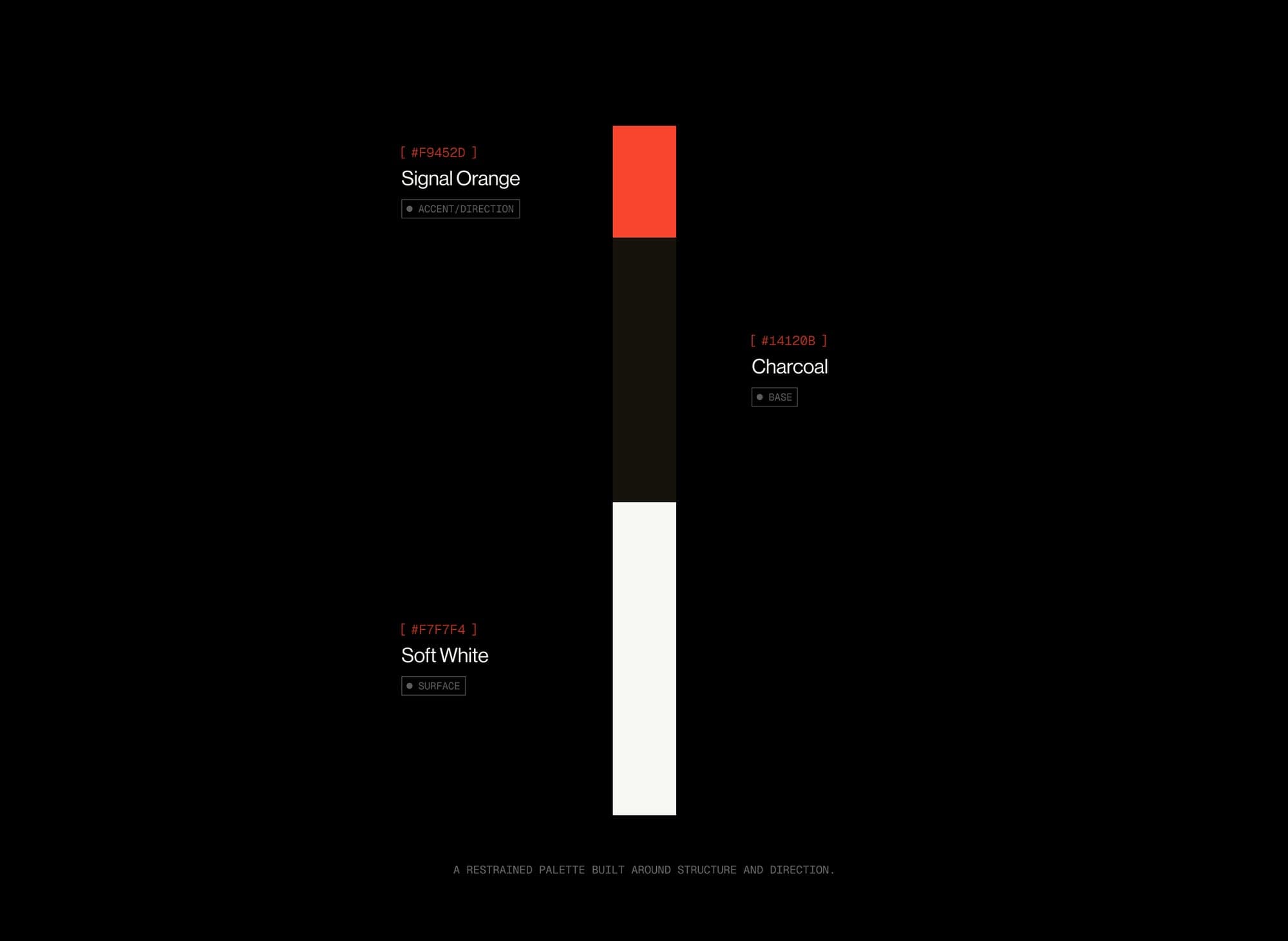
Three colours, and I fought to keep it at three.
Charcoal carries a trace of warmth, like paper left near a fire. Soft white does the same, because pure white on pure black reads as a hacking movie terminal.
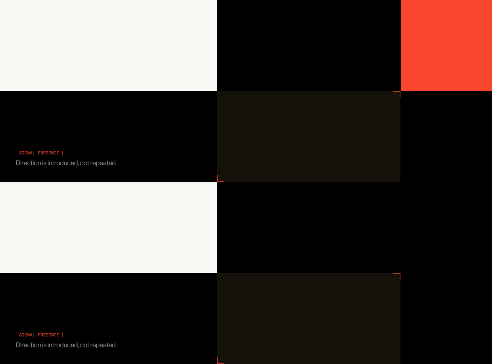
Then Signal Orange. It never fills large areas. It points. Dashed outlines, corner registration marks, labels. The accent behaves like a manicule.
When the colour system enacts the concept, the concept is load bearing rather than a nice paragraph in the deck.
[ 05 ]The system
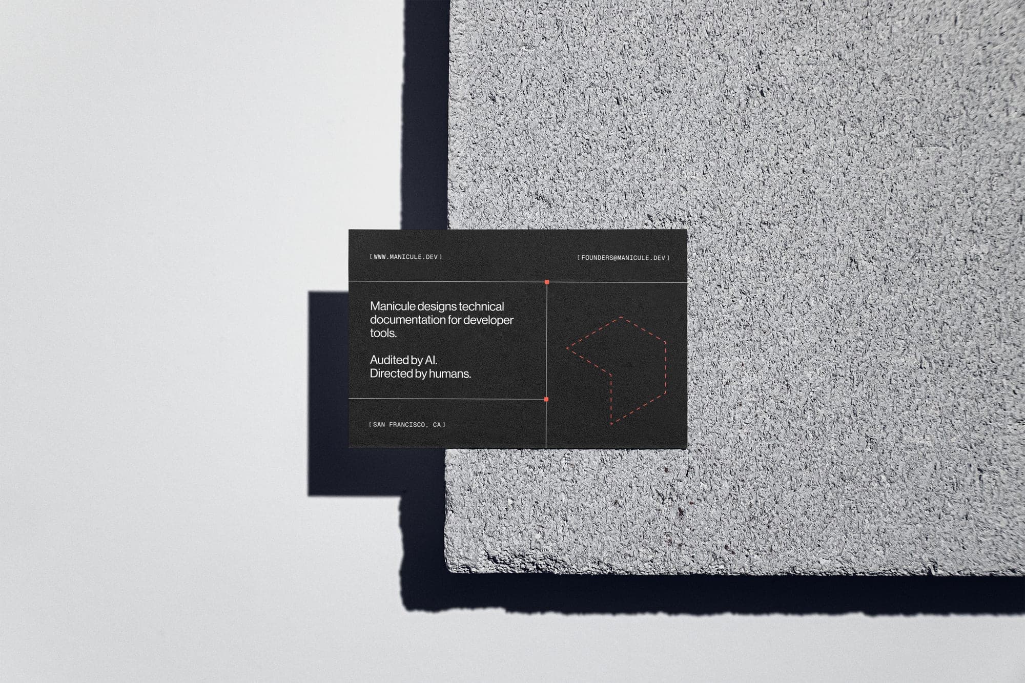
Everything should look like it came from a studio that documents its own work obsessively. Dashed keylines, corner marks, registration ticks, bracket labels. A Figma file with the annotations left on, deliberately.
Manicule's product is structure made visible, so the brand shows its own structure.
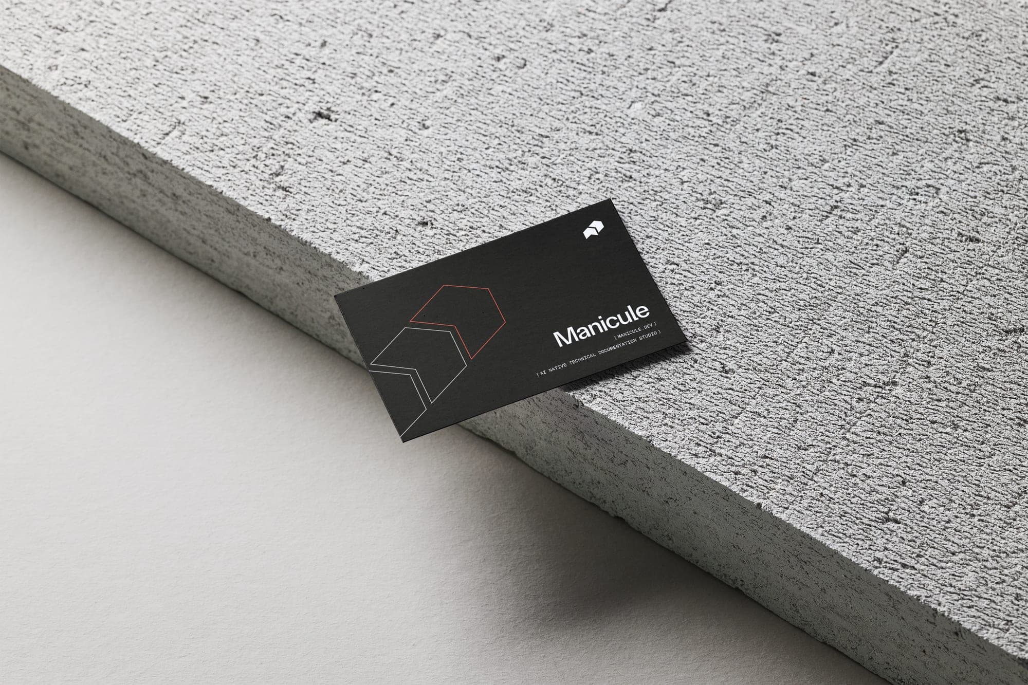
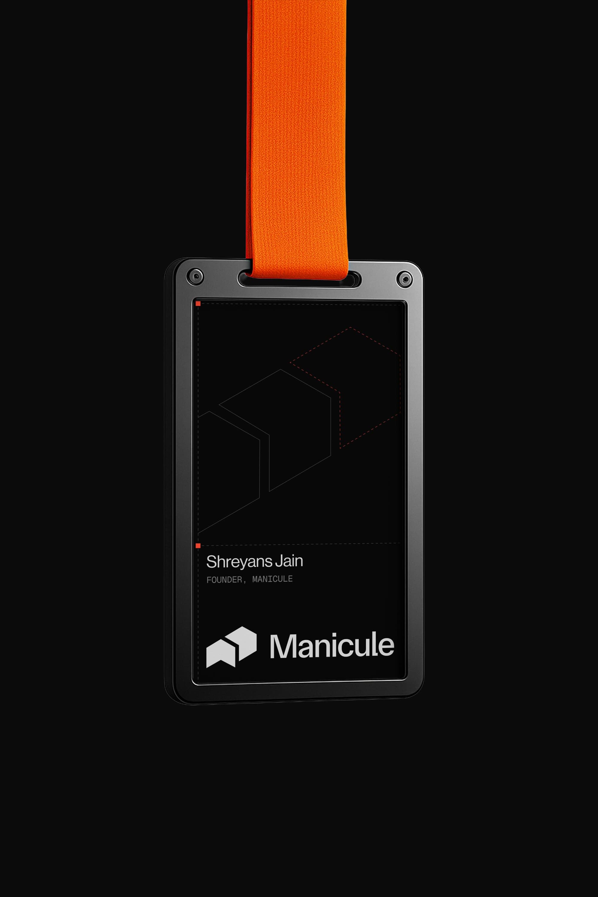
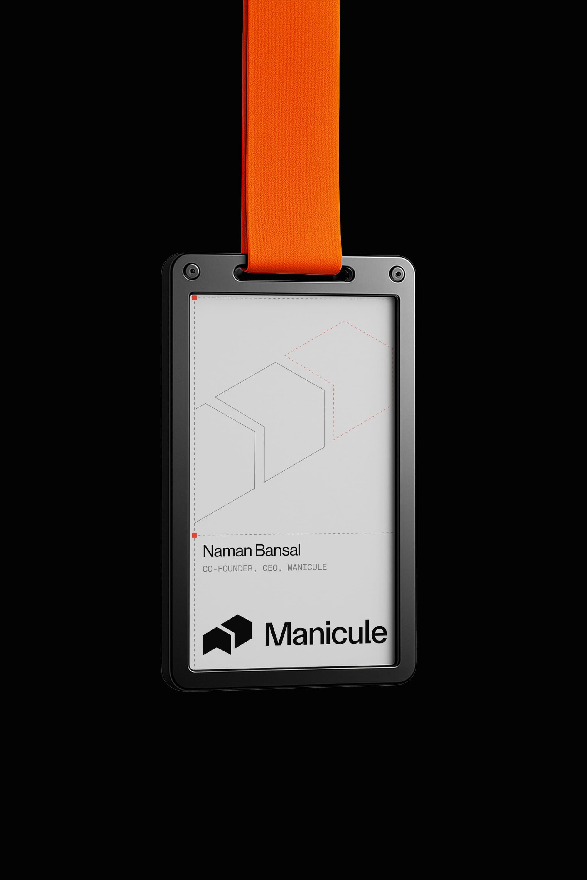
The ID cards were the favourite. A documentation company issuing credentials that look like annotated spec sheets. The outlined symbol sits behind: solid where things are established, dashed where they point forward.
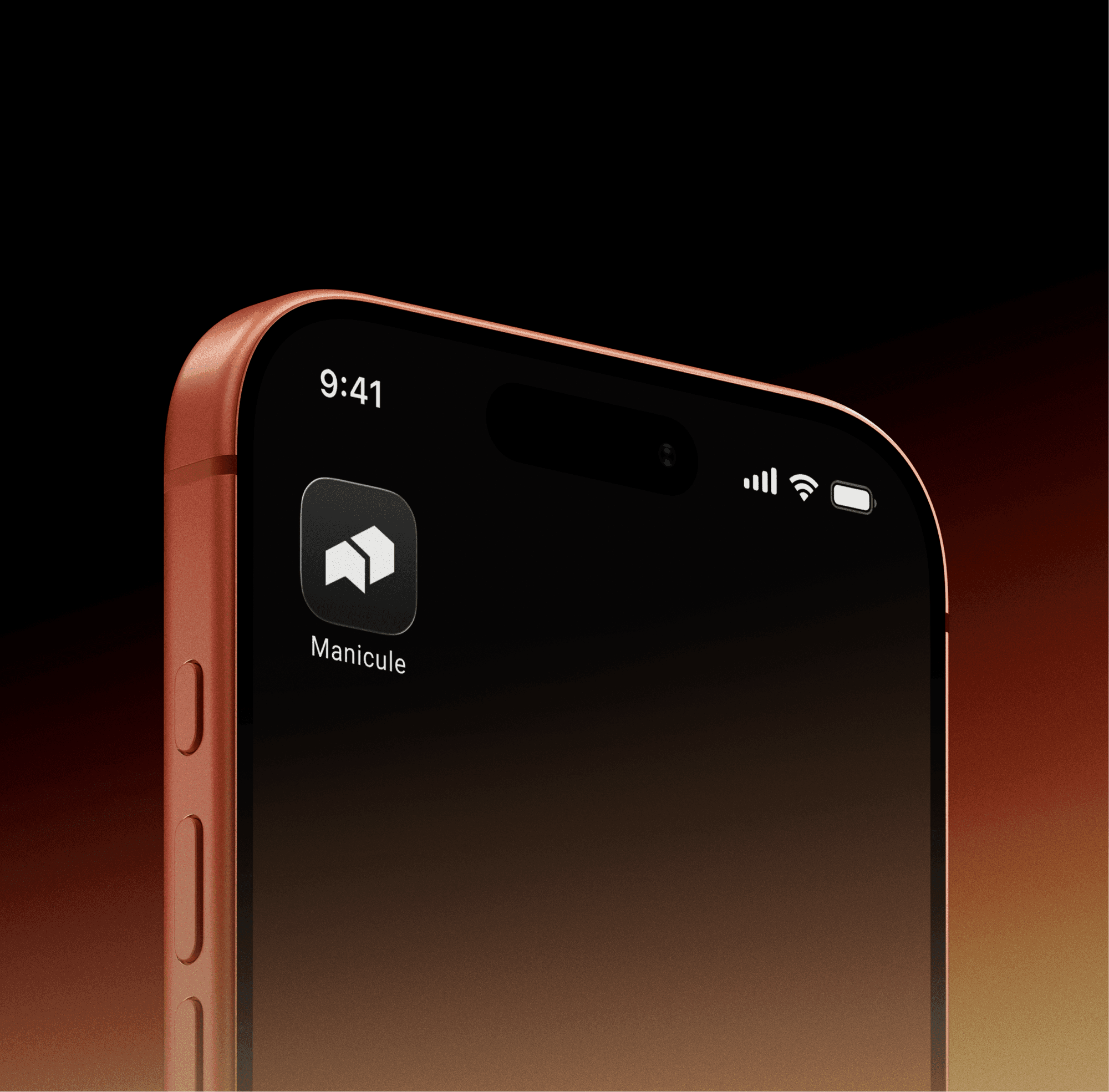
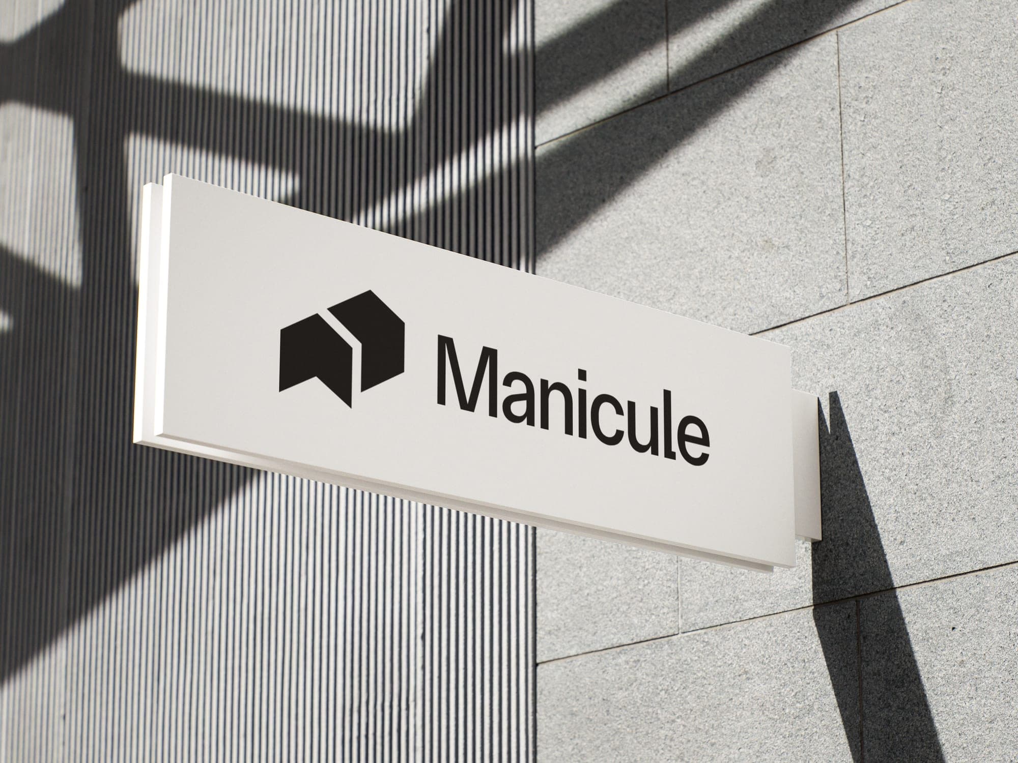
The mark had to survive as an app icon. This is where the geometric abstraction paid off. No thin strokes to disintegrate at 16 pixels. Two confident shapes, and signage that works as a directional object in physical space.
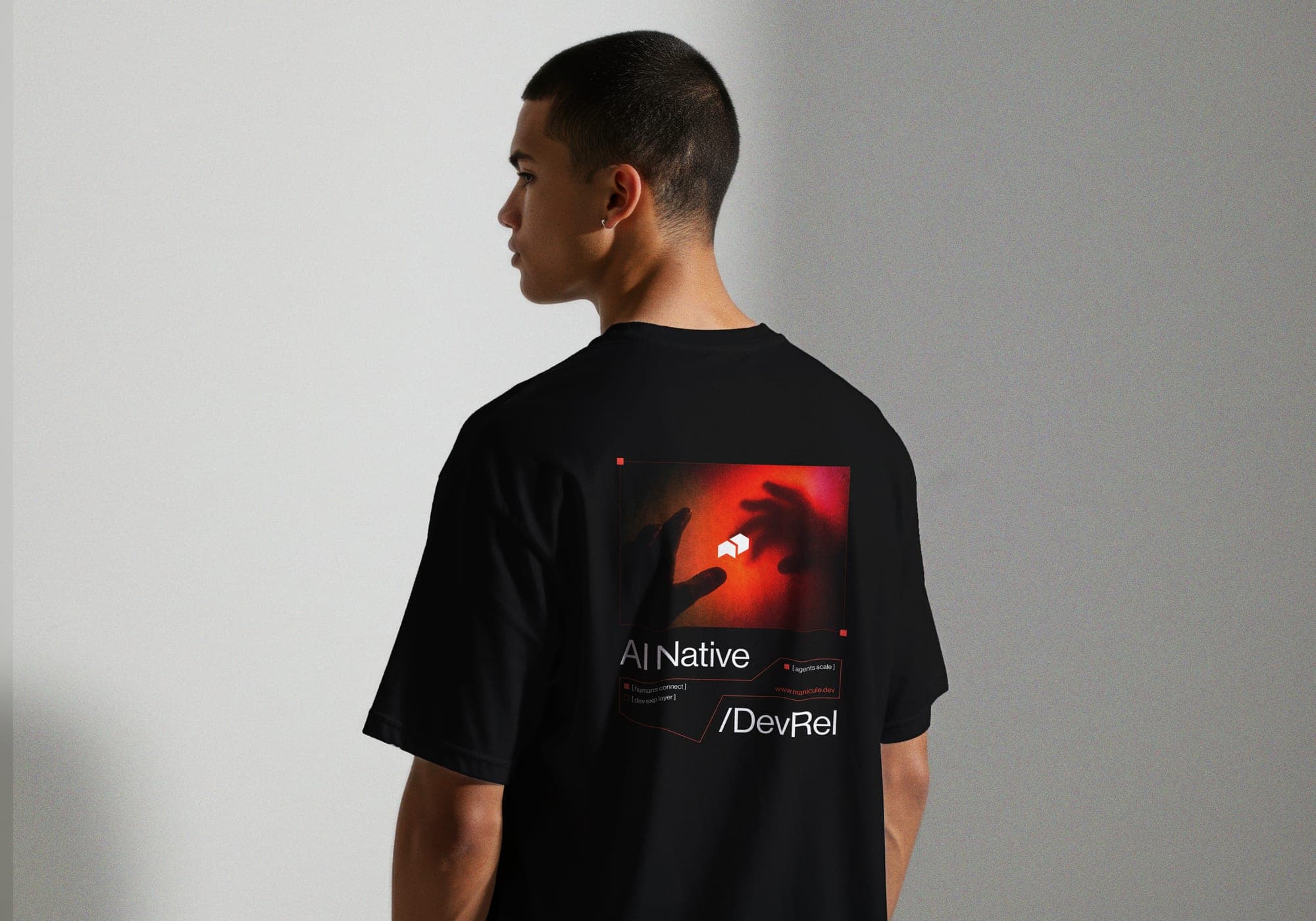
[ 06 ]Public communication
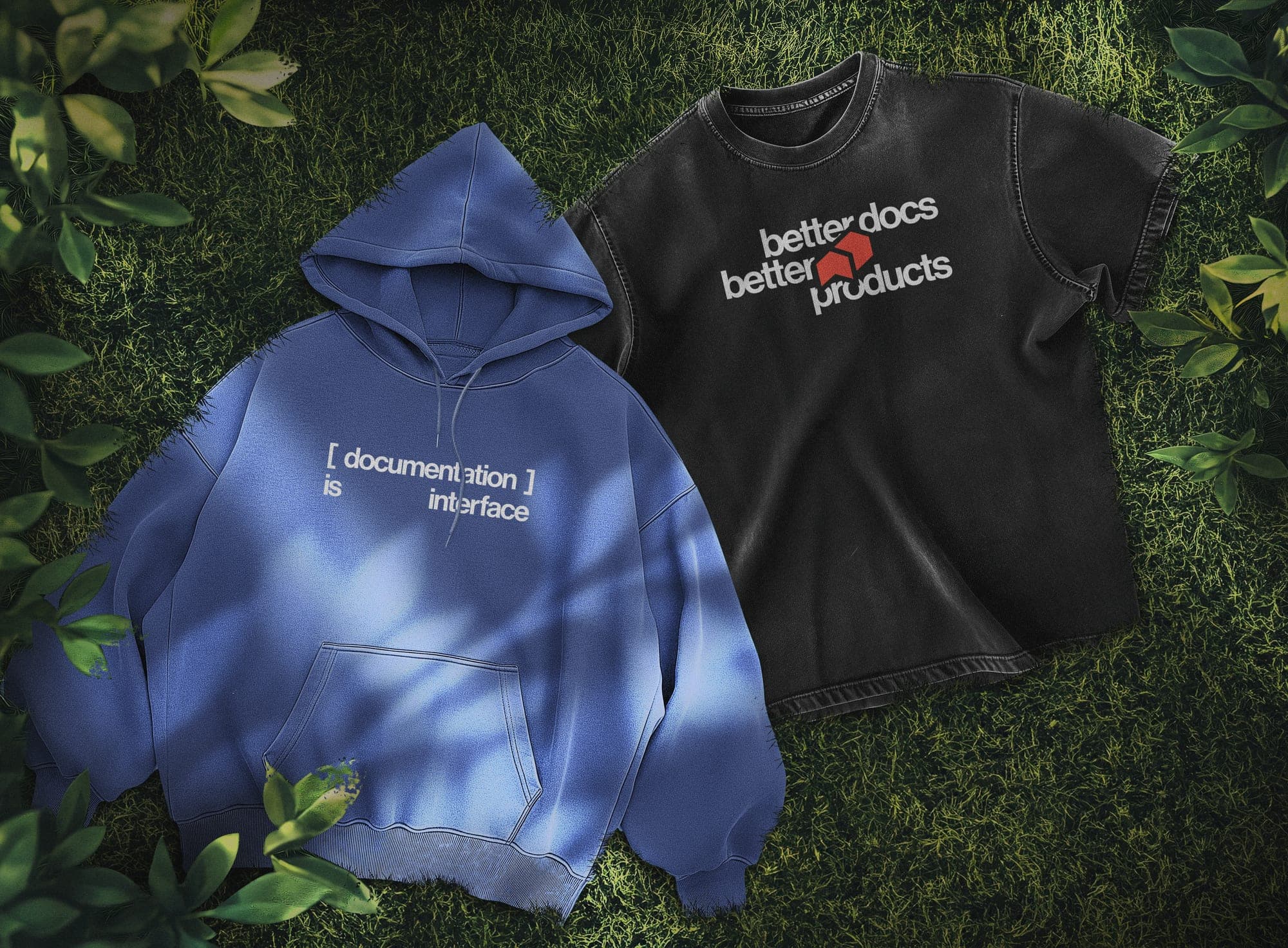
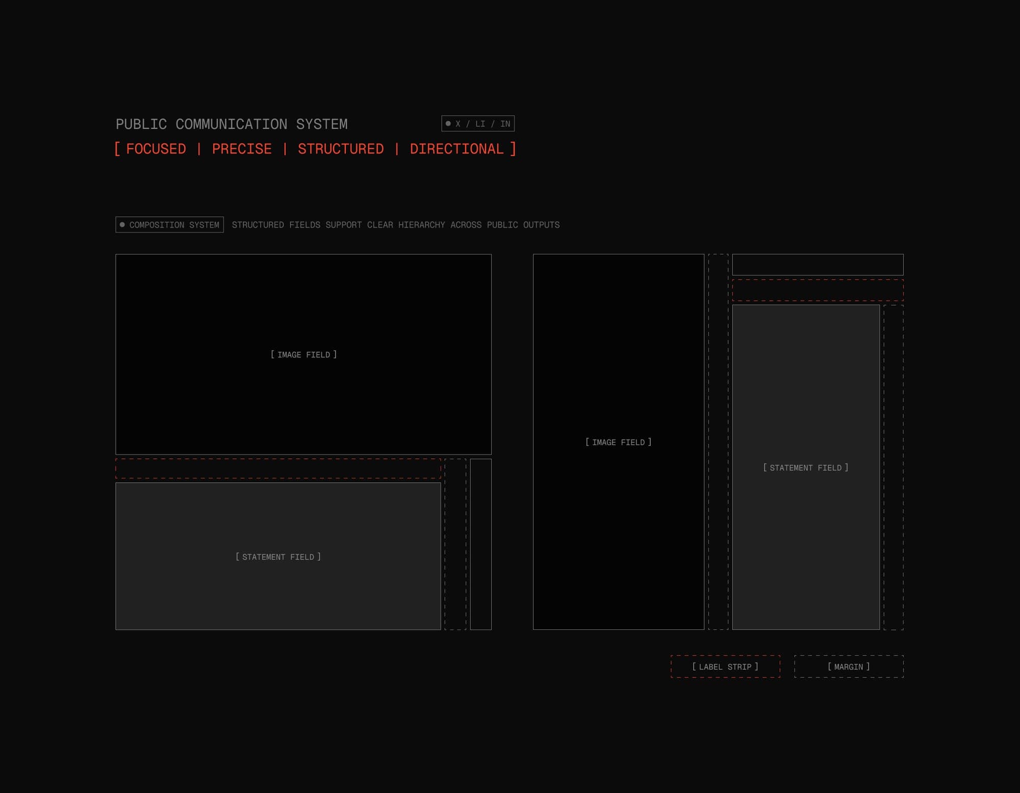
A composition system for social and marketing: image field, statement field, label strip, margins. Every post is assembled, not designed from scratch.
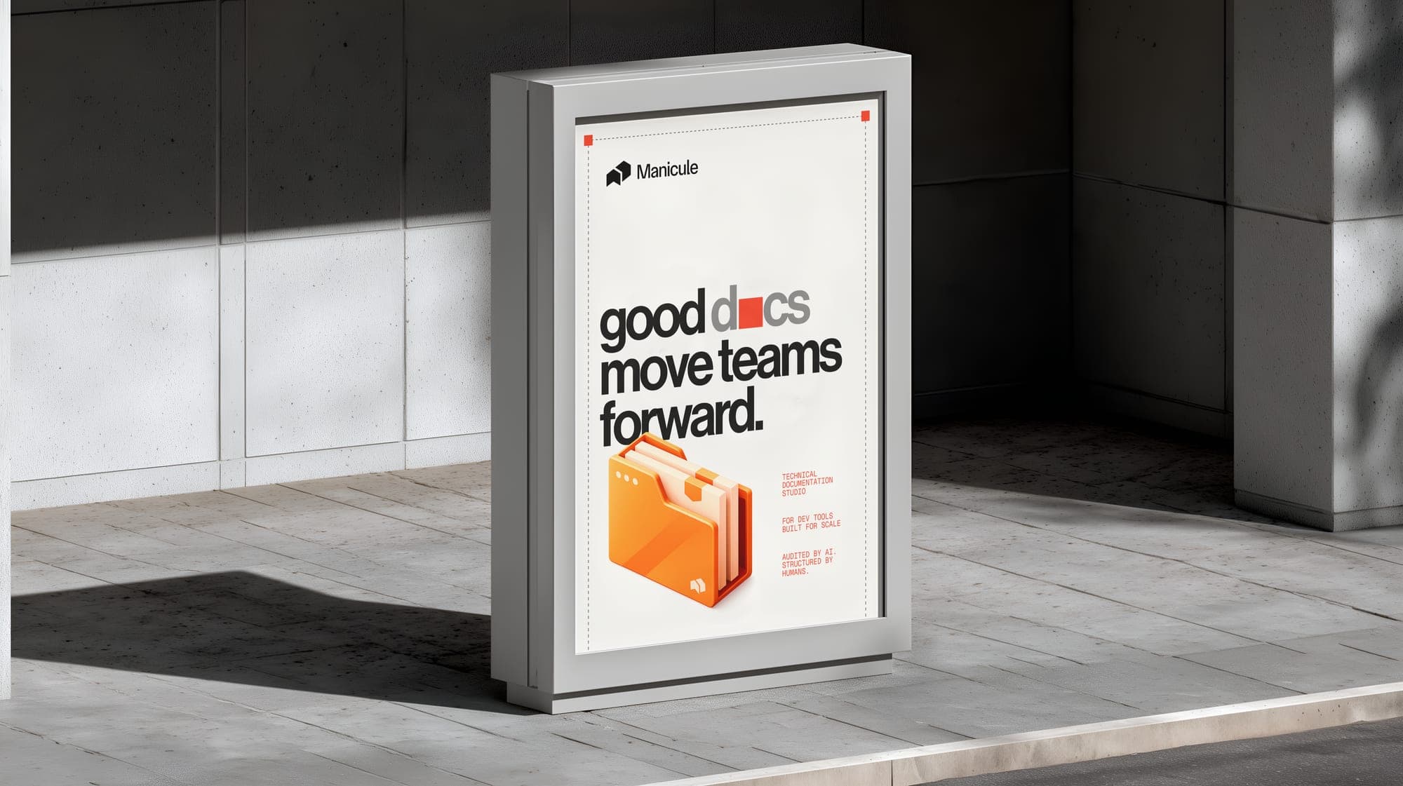
This is where Signal Orange goes to full volume. The core identity is restrained, almost monastic, which is fitting given where manicules come from. The restraint earned the marketing layer the right to shout.
The poster came last and is the favourite. The o in docs is swapped for an orange block, a redacted character waiting to be filled in. Practical use case: none. Zero regrets.
[ 07 ]The pivot
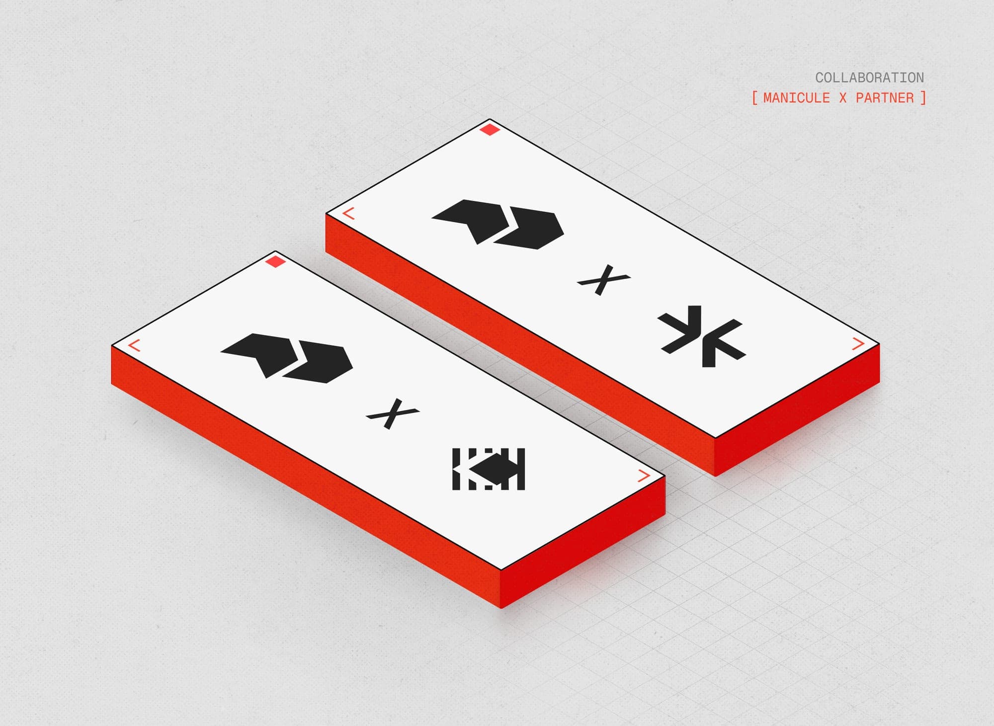
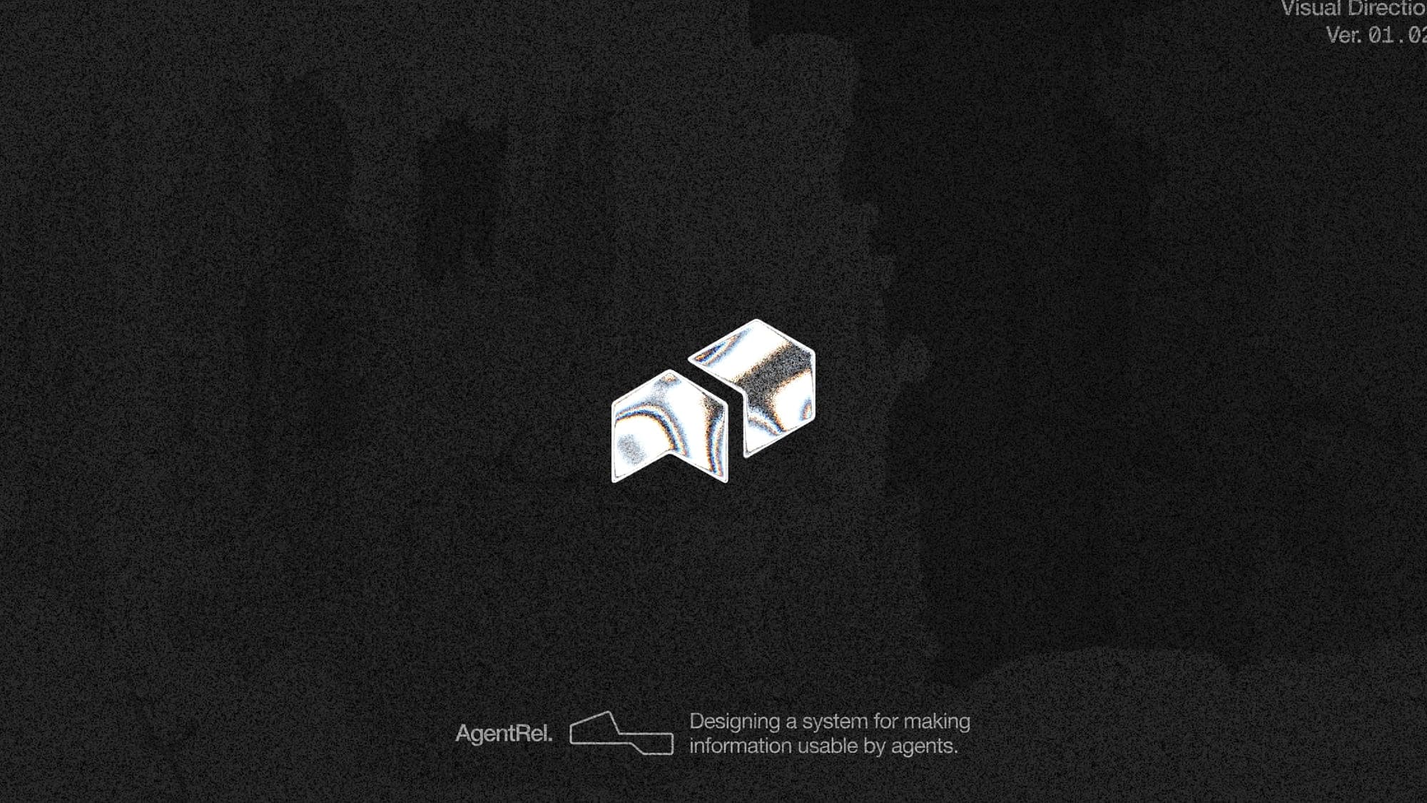
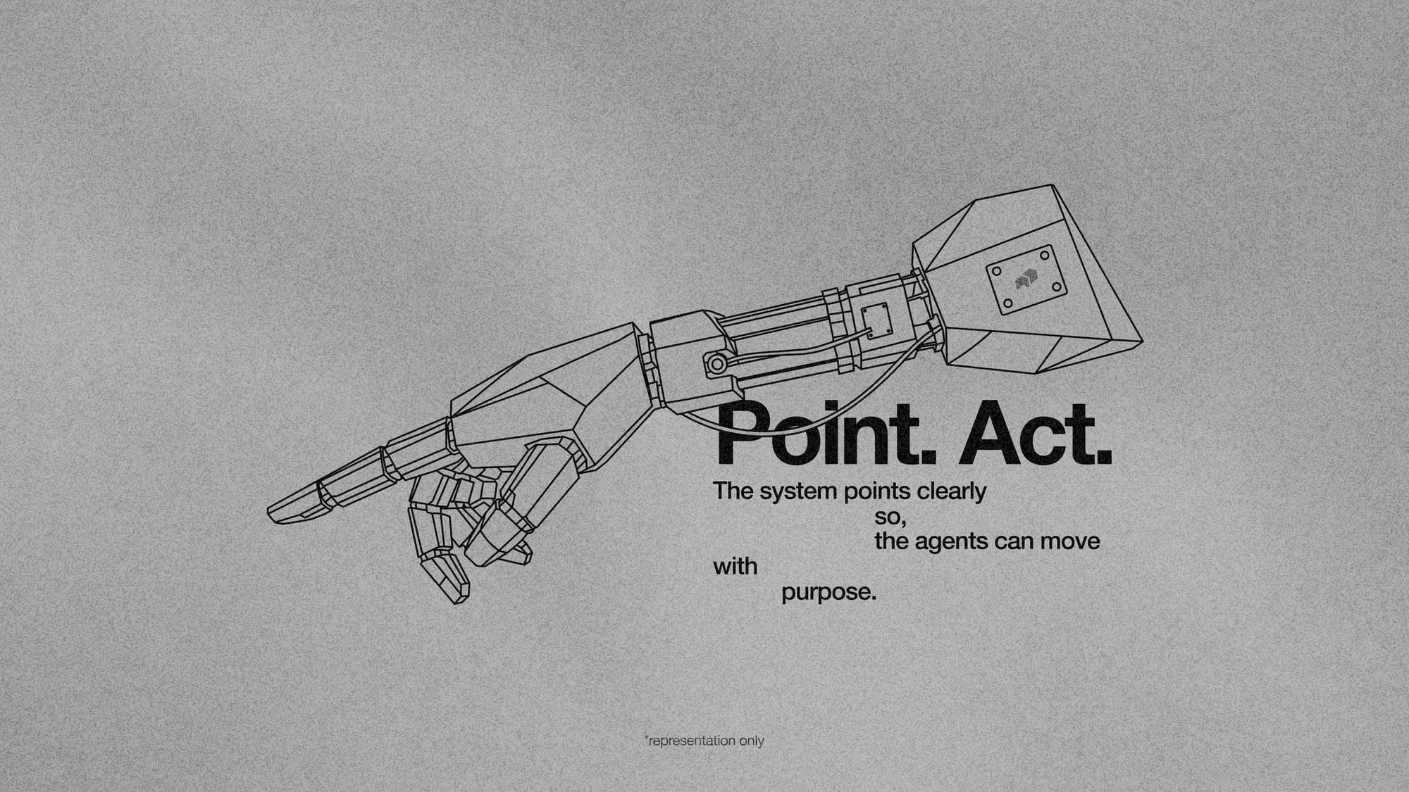
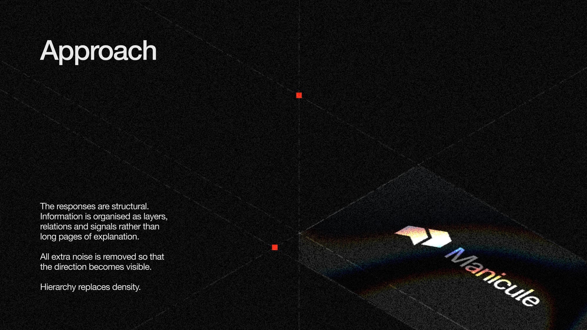
Six months after launch the founders came back with AgentRel. Agent Relations. Documentation is no longer read only by humans. It is crawled, parsed, embedded and cited by AI agents on behalf of humans who never open it.
New category, new vocabulary, non human audience. On paper, the kind of shift that means rebrand.
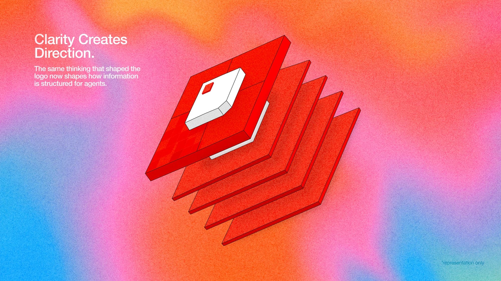
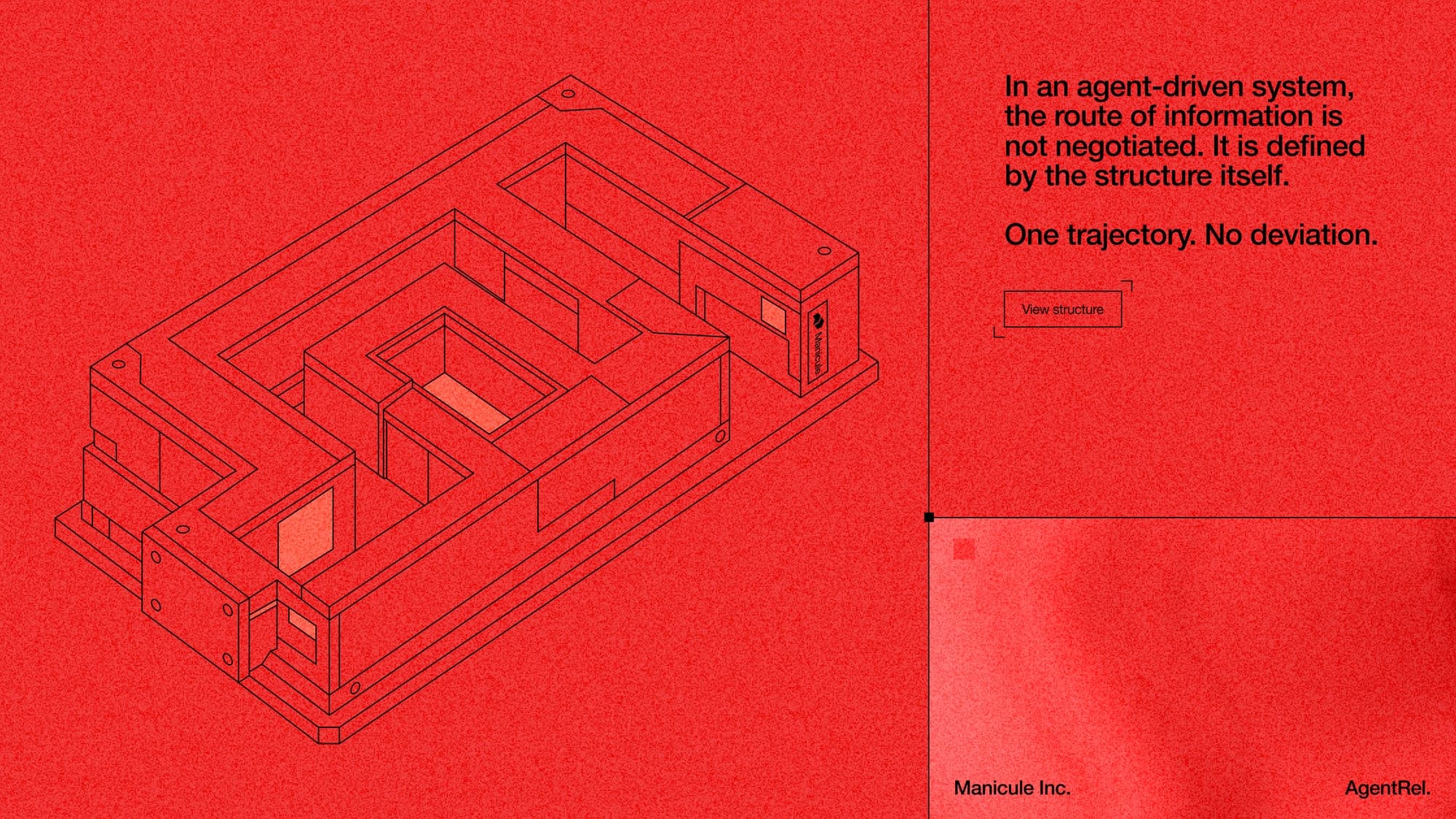
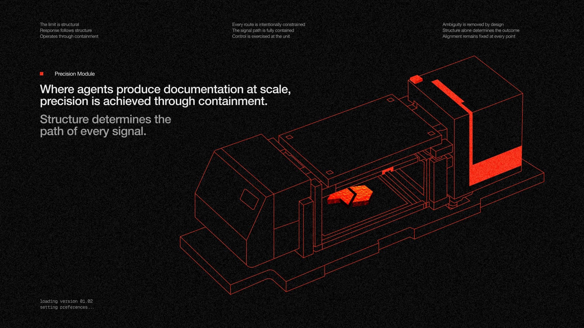
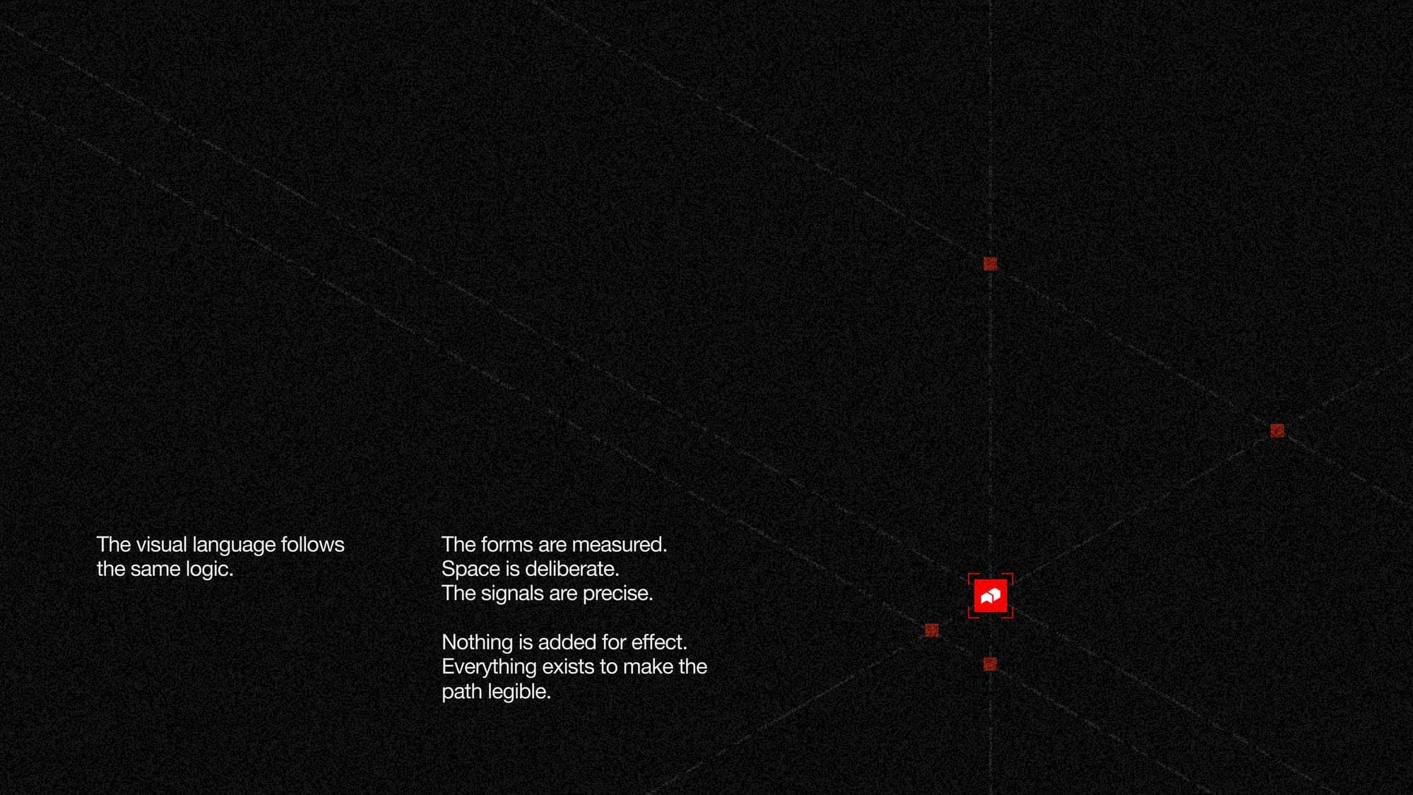
It didn't. The system already spoke this language. The manicule points. It pointed at humans in 1350 and it points at agents in 2026. Bracket labels already read as metadata. Registration marks already read as parsing anchors. The composition system already split content into structured fields.
So this was an extension, not a rebrand. Same bones, new muscle. The red is Signal Orange at full saturation, the isometric geometry is the mark's DNA scaled up, the labels are the same brackets from the business cards.
[ 08 ]The takeaway
The best concepts are already inside the company, waiting for someone to notice them. Manicule named itself after a 700 year old piece of marginalia that exists purely to point at what matters.
My job was to not get in the way. Build a system where the symbol points, the colour points, the labels point.
Then the company pivoted and the brand stretched instead of breaking. Same gesture, same concept, completely different audience.
Great documentation points people in the right direction. It points agents there too.
Design and direction by Souptik Debnath.
Brand identity, design systems, illustration, art direction. If you have something in this territory, the next one starts with a conversation.
[ SINCE 1350 ]
Look here.